


Navigating the Transit Workforce Data Dashboard
TWC’s Transit Workforce Data Dashboard is an interactive tool designed to facilitate data-driven decision-making on transit workforce development with intuitive charts and graphs. This valuable industry resource provides critical insights into employment metrics, helping to address key workforce issues such as recruitment, retention, and funding needs. The dashboard offers a picture of the current workforce composition as well as projections into the future, while allowing users to see how employment data vary by transportation mode, job function, and employment type (full-time v. part-time).
The Data Dashboard contains data from several sources including the U.S. Bureau of Labor Statistics (BLS) and the National Transit Database (NTD). It features the most recent data available and will continue to be updated as new information becomes available.
The Data Dashboard can be accessed on the TWC website under the Resources tab. Here are some tips to help get started.
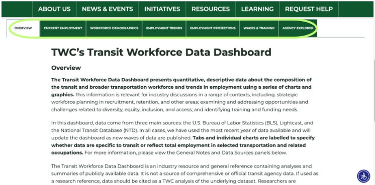
Charts are categorized into 6 topics and sorted by tabs labeled: Current Employment, Workforce Demographics, Employment Trends, Employment Projections, Wages & Training, and Agency Explorer.
First, select your desired topic.
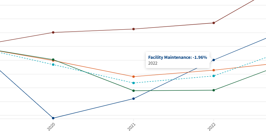
Next, customize. Tweak charts to best meet your individual information needs by selecting or deselecting data labels (example below).

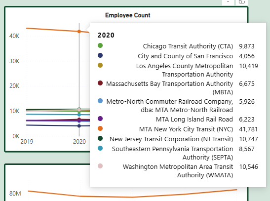
To see exact values, bring your cursor to any data point.
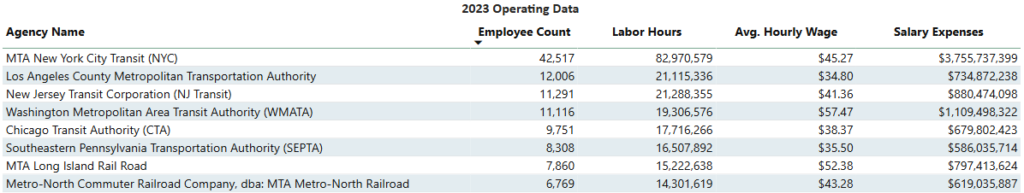
To see metrics for a specific agency or to make direct comparisons between agencies, visit the Agency Explorer.
The Agency Explorer allows users to find information on all directly operated services of full reporters to NTD. Available information includes employee count, average hourly wage, cost-of-living adjusted wages (calculated using C2ER’s cost-of-living index), labor hours, and salary expenses.
The upper four Agency Explorer charts will automatically show the 10 largest agencies by employee count, but users can select agencies of interest to create their own analysis. Add and subtract agencies as you like.
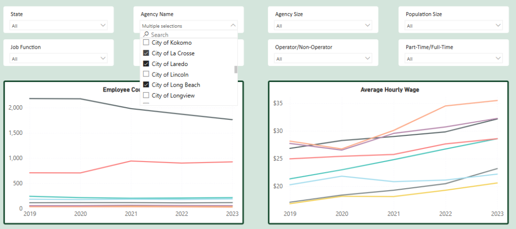
As you select or de-select agencies, the Agency Explorer will also adjust the Summary Statistics on the right of the screen which show total employees, average wage, average labor hours, average salary expenses, average vehicles operated in annual maximum service (VOMS), average unlinked passenger trips (UPT), and average population in the surrounding area.
Access exact values in list form by holding your cursor over desired data points.
Now, users should be able to use the Dashboard’s features to inform key decisions while navigating today’s challenges within the public transportation workforce. By embracing these insights, agencies can build a more resilient workforce that helps position themselves for future success.
Have any questions or ideas for new ways to engage with workforce data? Contact us at twc@transportcenter.org.
Contributing Authors: Lauren Smith